

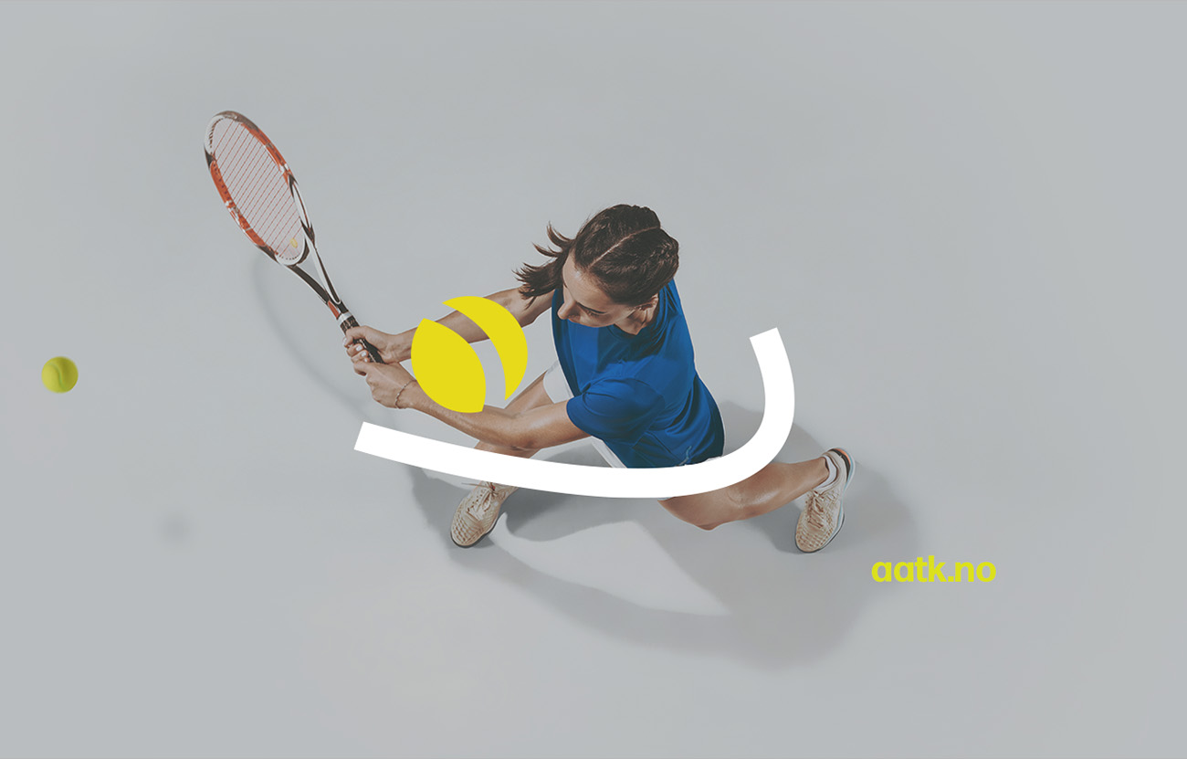

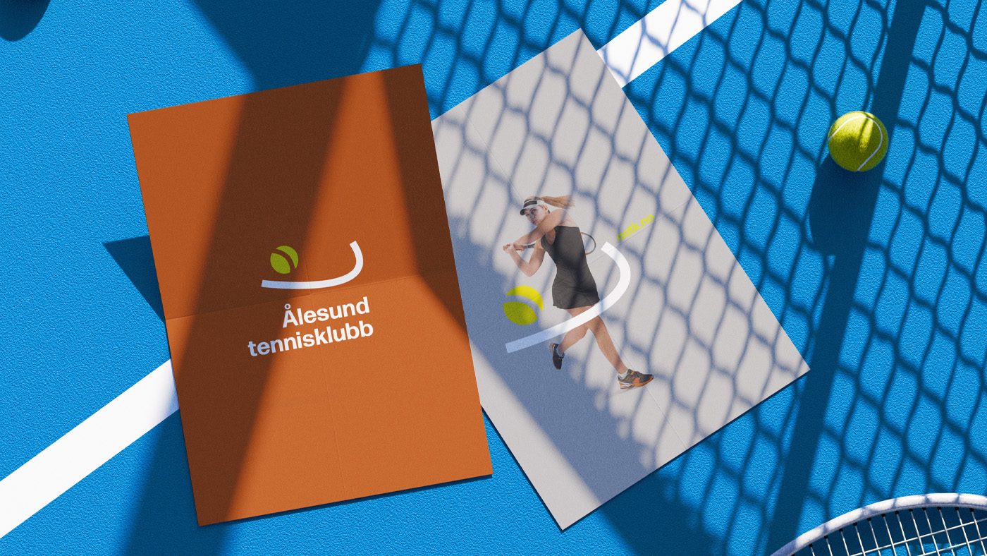

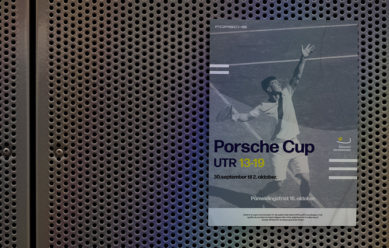
Designed for Ålesund Tennisklubb, through that logo I wanted to capture the split-second energy of tennis without relying on clichéd imagery. I tried to abstract the “moment of impact,” using a simple arc to suggest the player’s swing and body movement just before hitting the ball. My goal was to create a mark that feels dynamic and alive, implying motion rather than just displaying a static object. I focused on clean geometry to ensure the logo remains versatile and legible across all club materials, from uniforms to digital platforms.