
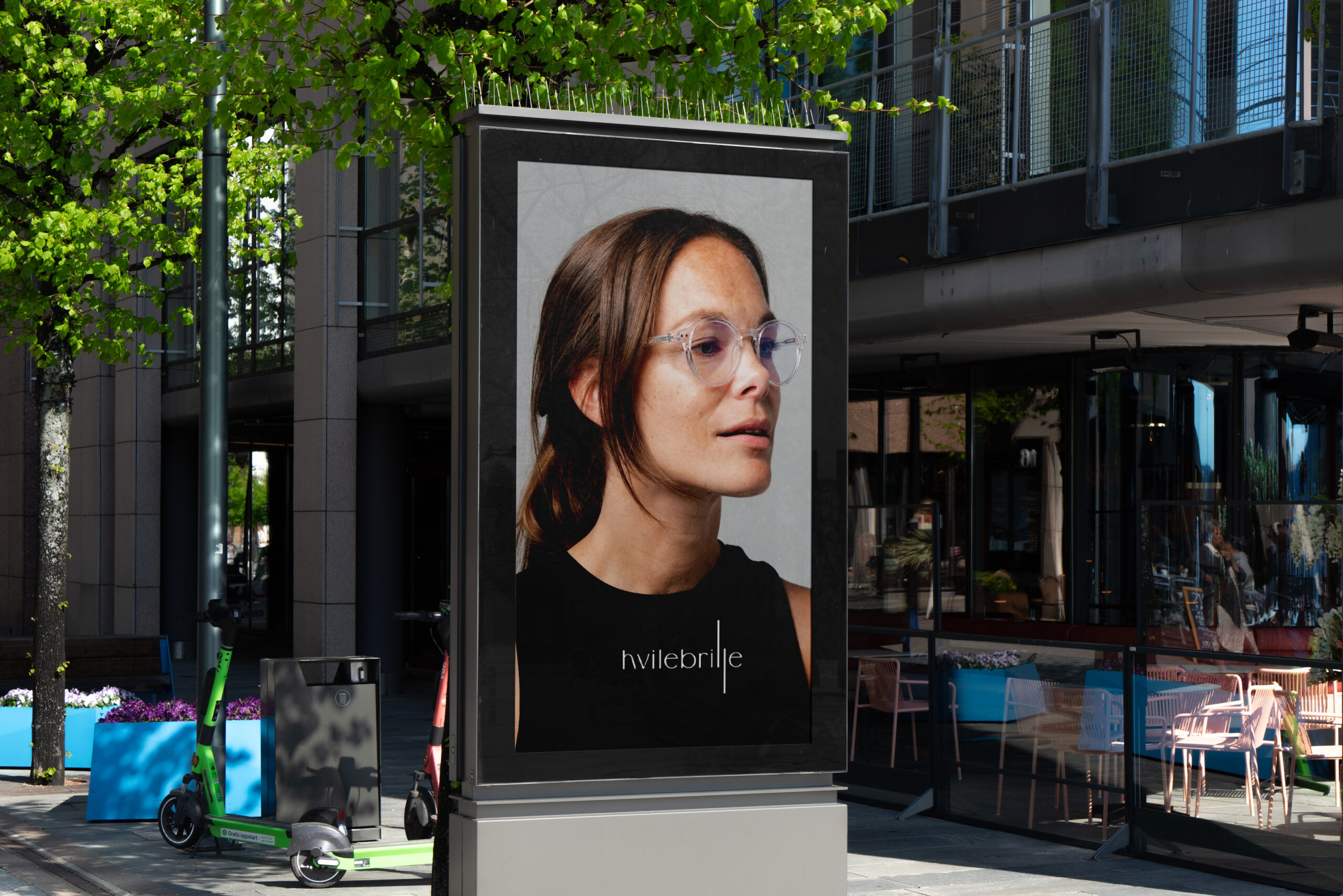
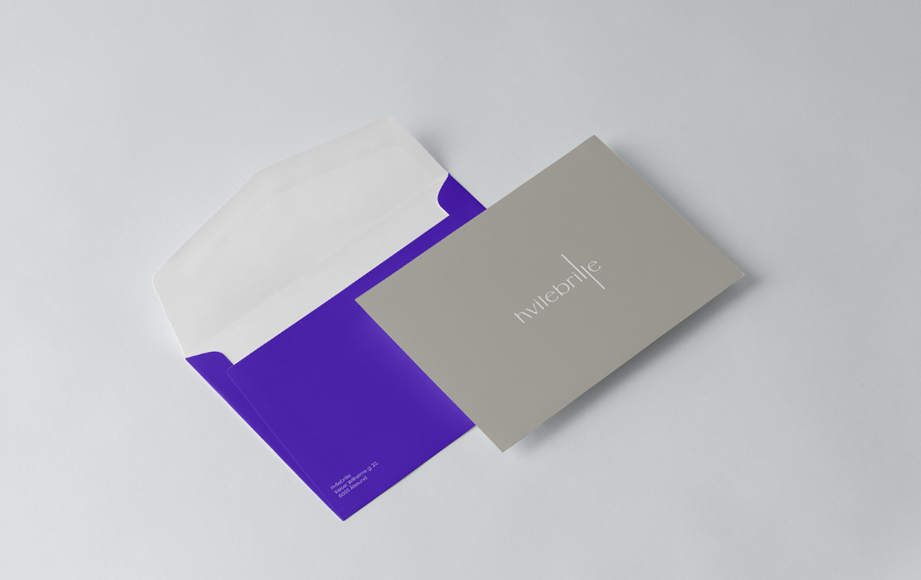
Hvilebrille
Hvilebrille is a Norwegian eyewear brand; the name roughly translates to “resting glasses,” implying a focus on leisure or reading frames.
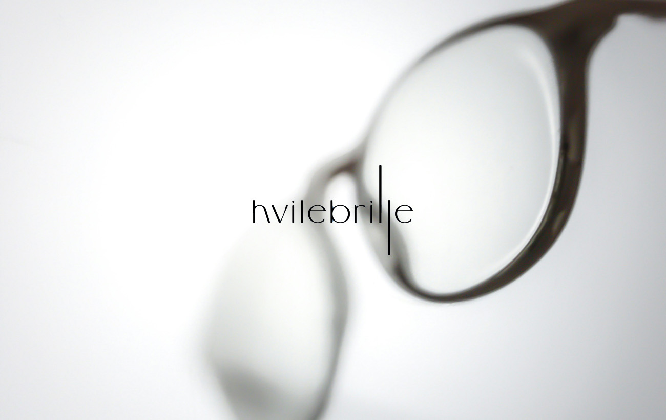
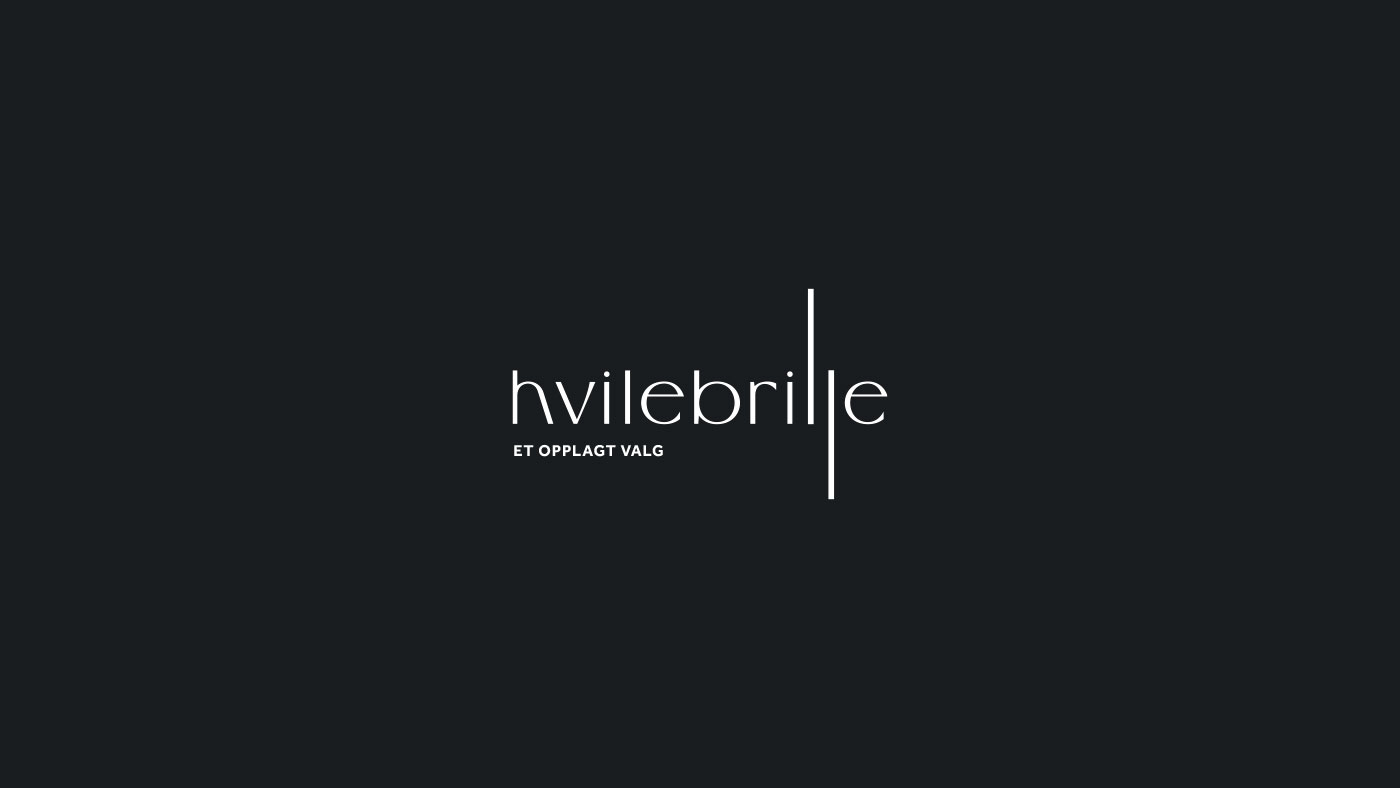
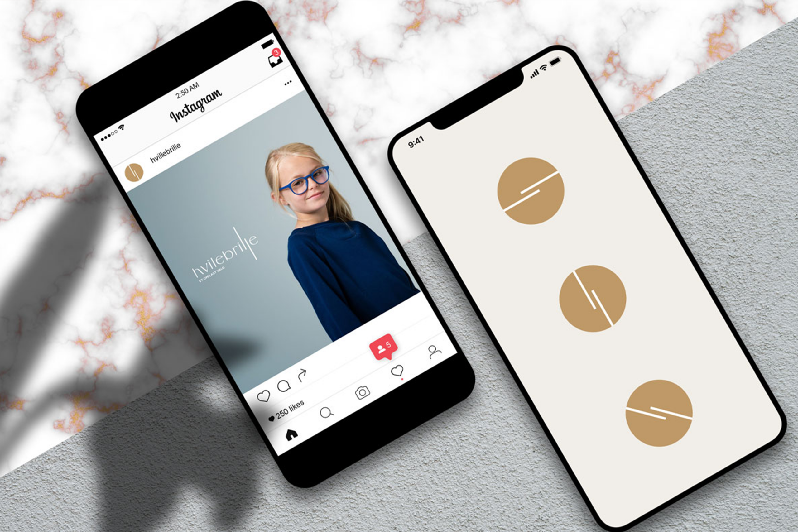
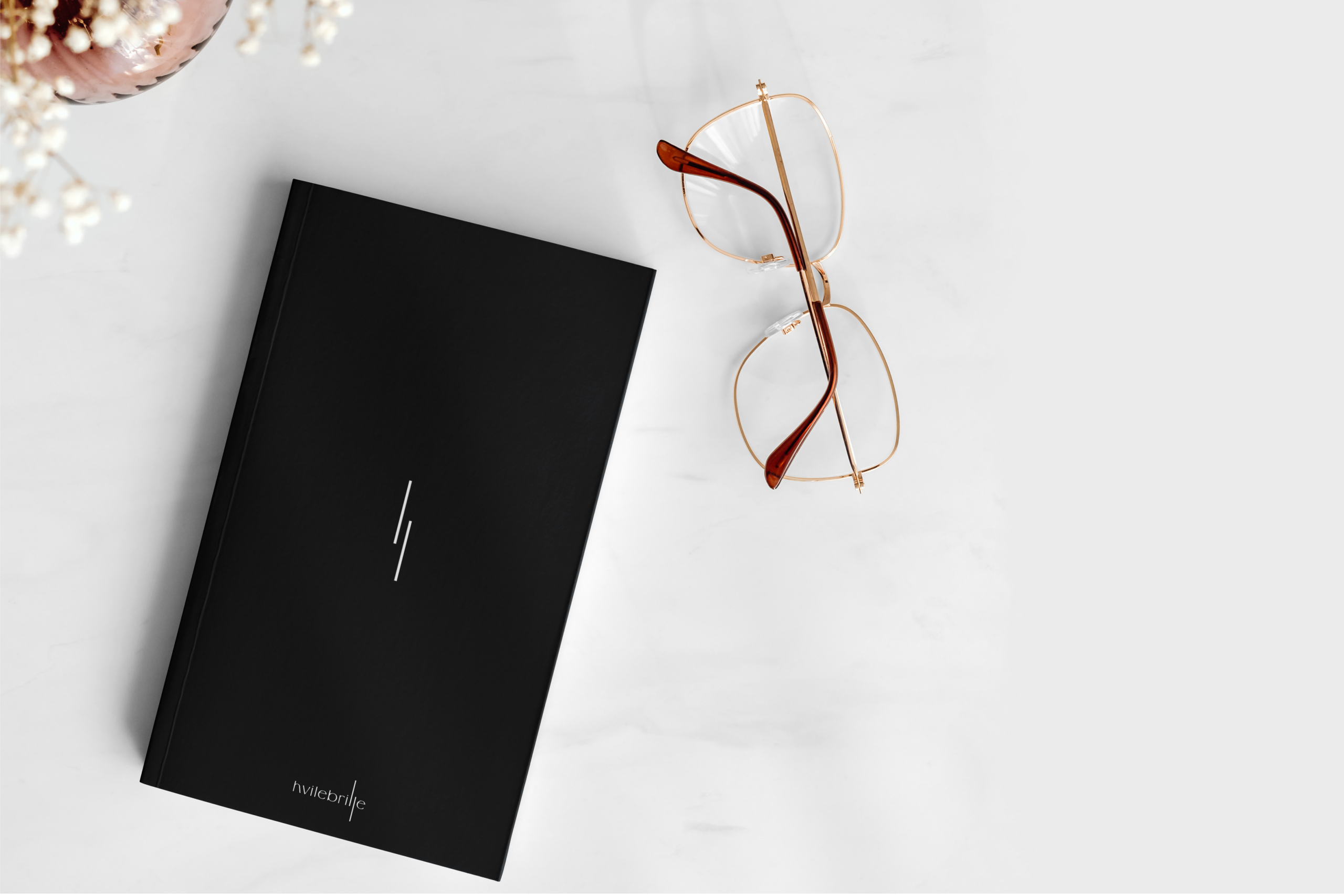
The design relies on a custom, high-contrast typeface. The letterforms are notably slender and geometric, creating a sense of lightness and precision. Characters like the “h” and “b” feature sharp, unadorned curves, while the overall spacing is generous, giving the logo an airy, modern feel.
The focal point is the typographic modification of the two “l”s. Extended vertically, they stretch beyond the baseline and x-height to mimic the arms or bridge of a pair of glasses. This structural tweak transforms the text into a visual cue for the product without adding external icons. This proposal was not selected by the client, but it illustrates how simple adjustments to letter proportions can effectively communicate a brand’s function.